


Strozzina | Logo Restyle & Brand Identity
This is an academic mock project that aims to a complete restyle of Strozzina's brand identity. Strozzina is considered a center of contemporary culture, that wants to give to new talented people the possibility to exhibit they artworks, which can be not only artistic but also technological, putting them in contact with international famous exhibitors. For this reason, Strozzina seems to be a kind of meeting point between famous talents and new, unknown ones. Also, Strozzina organizes a lot of different events, being strongly interested to educational projects and workshops.
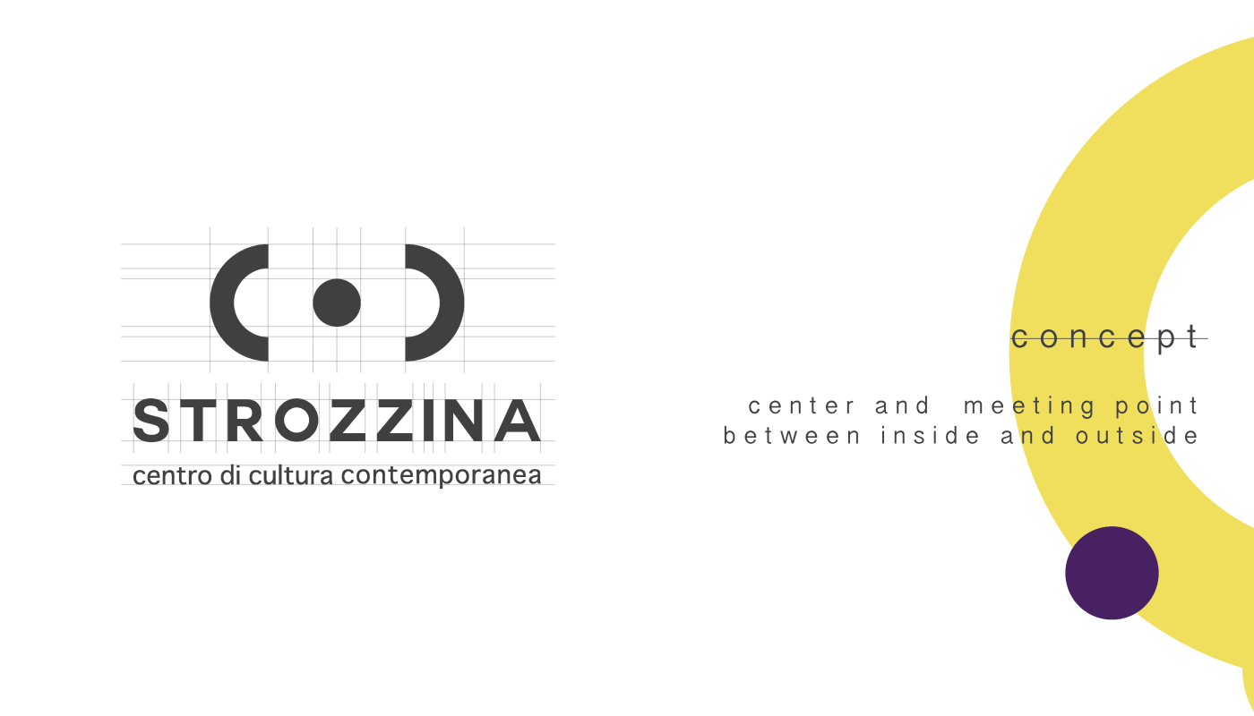
At the moment, Strozzina's logo is focused on the 3 ''c'' - center, cultural and contemporary.

I think that is important to consider these 3 elements as they perfectly resume what Strozzina is. But, I also consider that the ''cultural meeting point'' should be underlined as well. I find an interesting connection and ''attraction'' between internal Strozzina (already known and famous talents) and external to Strozzina (new talents), who the center offers visibility to. All these characteristics should in some way be highlighted in Strozzina's brand identity.
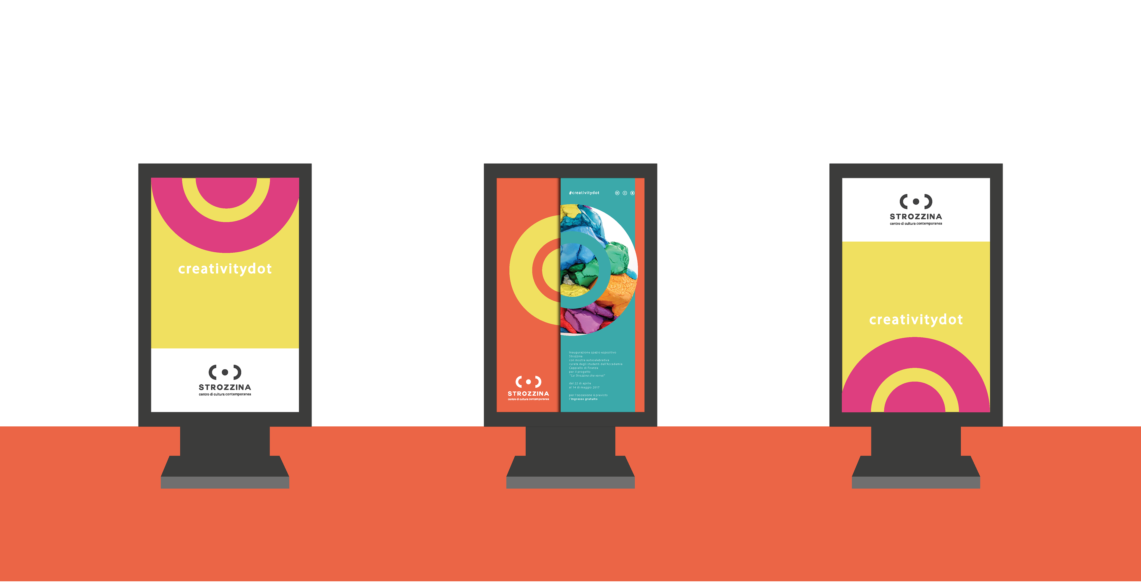
This is what I've tried to do, capturing all these meanings and give them a shape, a contemporary one.
And this is the result, a simple circle that contains all the characteristics treated above.
The circle is a perfect shape, no other figure could better describe a center.
If you divide it in two parts, you have exactly what is missing, the two ''c'' letters for culture and contemporary.
By living the two ''c'' divided, it seems that the round middle shape is trying to attract them, as well as Strozzina does with famous and not yet famous artists.
Hope you like it :)